import numpy as np
import matplotlib.pyplot as plt
import matplotlib as mpl
import matplotlib.ticker as mticks
from PIL import Image
import copyIn this notebook, we will go over a few “dos” and “donts” for making plots.
# Set your RC Parameters in MatPlotLib
rcParamBackup = copy.deepcopy(mpl.rcParams)
# Here, I'm going to set the font size too small for illustration. We'll change it back later
mpl.rcParams['font.size'] = 7data = {}
for key, filename in [
('x', 'X.csv'),
('y', 'Y.csv'),
('z', 'Z.csv')
]:
# Data is stored on the disk in two columns.
# Later on, we will decompose into two variables based on
# two rows. Doing the transpose here with a .T makes it
# easier to do that later
data[key] = np.loadtxt(filename, delimiter=',').Tfig, ax = plt.subplots(sharex=True, figsize=(12, 4))
for key, (xdata, ydata) in data.items():
plt.loglog(xdata, ydata, label=key)
ax.spines['top'].set_visible(True)
ax.spines['right'].set_visible(True)
ax.set_xlabel('Integration time (s)')
ax.legend(loc='best')
ax.set_ylabel('Allan deviation (dps)')
ax.grid(which='both', ls='dotted')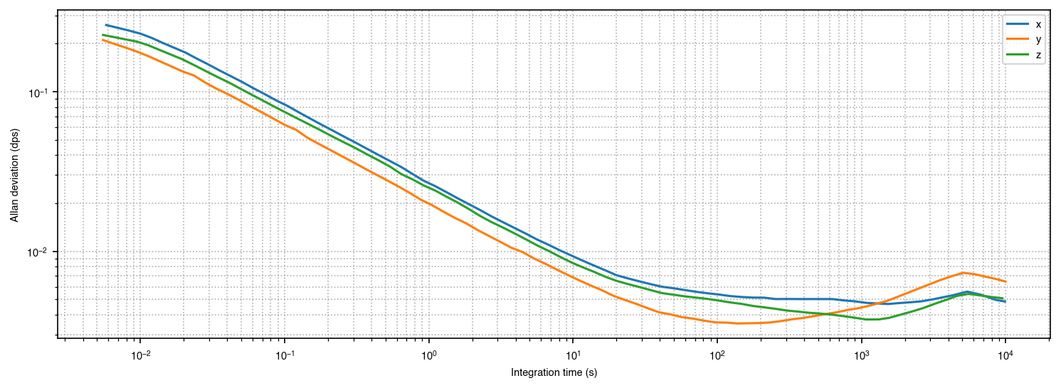
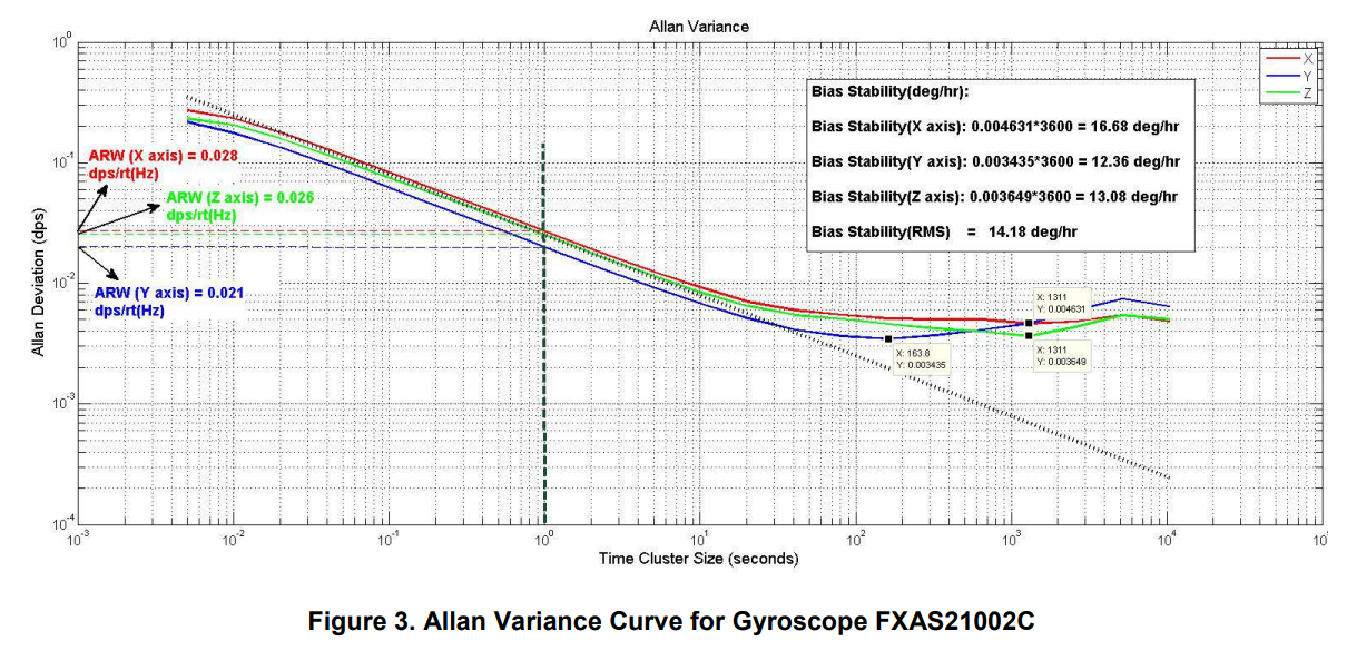
Many of the Allan deviations that I see in the literature look like this. There’s several problems:
- The text is way too small
- The graph is too wide. The important parts of the graph are on the bottom right, far away from the left legend
- The y-axis units take some time to parse (dps? Is that damage per second… no, this is a gyroscope… ahh, degrees)
- Lots of extra lines lead the eyes away from the data
colordict = {'x': 'red', 'y': 'green', 'z': 'blue'}
fig, ax = plt.subplots(sharex=True)
for key, (xdata, ydata) in data.items():
    plt.loglog(xdata, ydata, label=key, color=colordict[key])

ax.set_xlabel('Integration time (s)')
ax.legend(loc='best', frameon=False)
ax.set_ylabel('Allan deviation (dps)')
ax.set_aspect(2)

fname = 'foo.png'
plt.savefig(fname)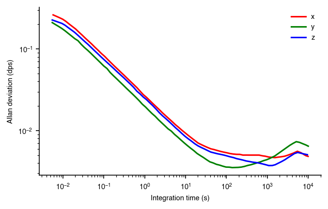
This chart is a bit better. The chart junk is gone, and we’ve set the aspect ratio to 2 so we can easily see the slope of -1/2 characteristic of ARW. Furthermore, we’ve also adopted a more standard color mapping for XYZ used in 3D graphics (x is red, y is green, z is blue). We can make some other refinements as we go along.
# opening image using pil
image = Image.open(fname).convert("L")

# mapping image to gray scale
plt.imshow(image, cmap='gray')
plt.axis('off')
plt.show()
This is how the graphic looks in grayscale. It’s not great, because the blue is dark, but the red and the green are rather light.
colordict = {'x': 'tab:red', 'y': 'tab:green', 'z': 'tab:blue'}
fig, ax = plt.subplots(sharex=True)
for key, (xdata, ydata) in data.items():
    plt.loglog(xdata, ydata, label=key, color=colordict[key])

ax.set_xlabel('Integration time (s)')
ax.legend(loc='best', frameon=False)
ax.set_ylabel('Allan deviation (dps)')
ax.set_aspect(2)

fname = 'foo.png'
plt.savefig(fname)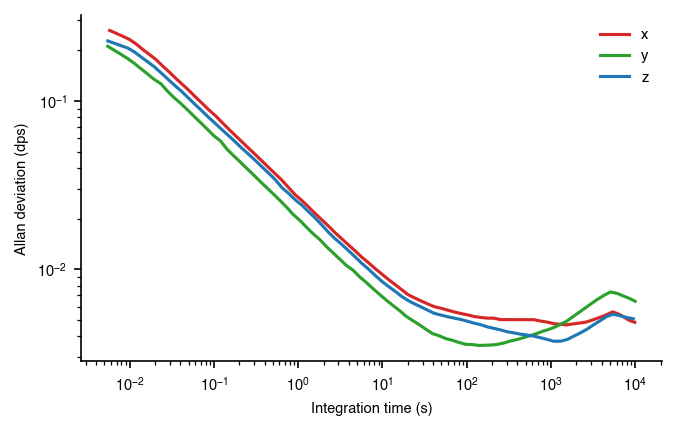
We can use the tableau color map to take a little bit of the saturation out. The colors look a little more professional and less cartoony
# opening image using pil
image = Image.open(fname).convert("L")

# mapping image to gray scale
plt.imshow(image, cmap='gray')
plt.axis('off')
plt.show()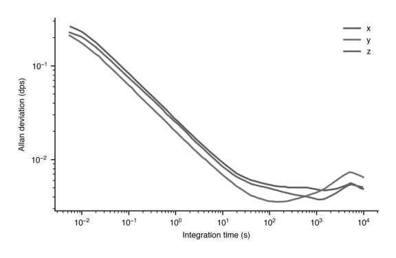
Gray scale is still a little hard to see which color is which.
colordict = {'x': 'xkcd:light red', 'y': 'xkcd:kiwi green', 'z': 'xkcd:mid blue'}
fig, ax = plt.subplots(sharex=True)
for key, (xdata, ydata) in data.items():
    plt.loglog(xdata, ydata, label=key, color=colordict[key])

ax.set_xlabel('Integration time (s)')
ax.legend(loc='best', frameon=False)
ax.set_ylabel('Allan deviation (dps)')
ax.set_aspect(2)

fname = 'foo.png'
plt.savefig(fname)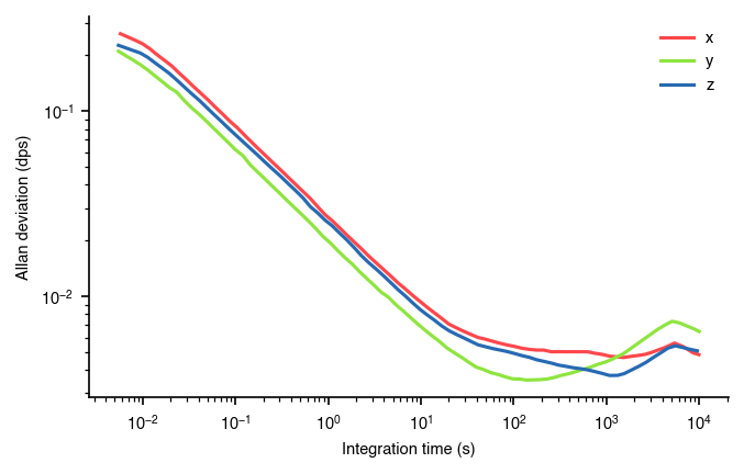
# opening image using pil
image = Image.open(fname).convert("L")

# mapping image to gray scale
plt.imshow(image, cmap='gray')
plt.axis('off')
plt.show()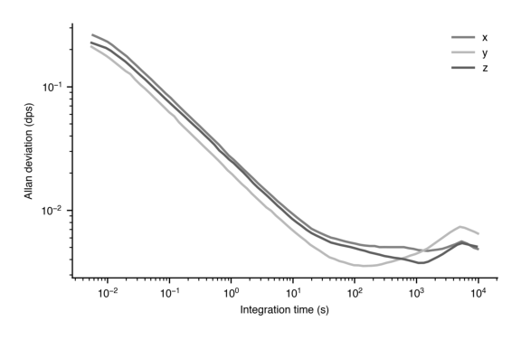
Yes, here we have set the green to be very light, and the blue to be very dark. They are now discernable in black and white. However, you may be better off just using dashed or dotted curves to differentiate.
colordict = {'x': 'tab:red', 'y': 'tab:green', 'z': 'tab:blue'}
fig, ax = plt.subplots(sharex=True)
for key, (xdata, ydata) in data.items():
    plt.loglog(xdata, ydata * 3600, label=key, color=colordict[key])

ax.set_xlabel('Integration time (s)')
ax.legend(loc='best', frameon=False)
ax.set_ylabel('Allan deviation (deg/h)')
ax.set_aspect(2)

fname = 'foo.png'
plt.savefig(fname)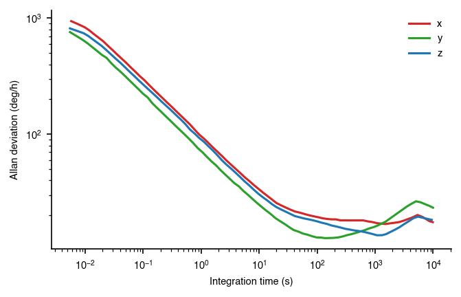
colordict = {'x': 'tab:red', 'y': 'tab:green', 'z': 'tab:blue'}
fig, ax = plt.subplots(sharex=True)
for key, (xdata, ydata) in data.items():
    plt.loglog(xdata, ydata * 3600, label=key, color=colordict[key])

ax.set_xlabel('Integration time (s)')
ax.legend(loc='best', frameon=False)
ax.set_ylabel('Allan deviation (deg/h)')
ax.set_aspect(2)
ax.spines['left'].set_position(('data', 1))

fname = 'foo.png'
plt.savefig(fname)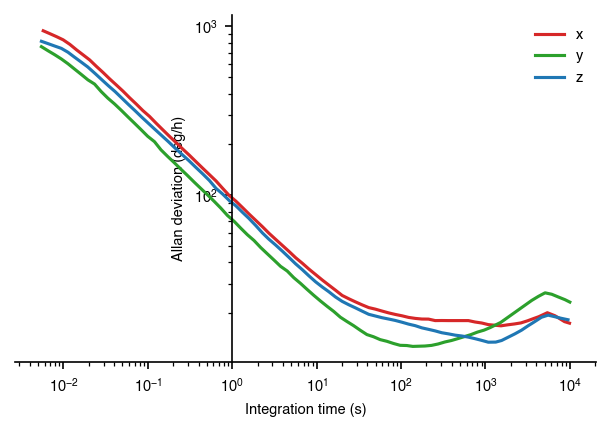
In this graphic, we’ve scaled the y-axis to show it in deg/h. Furthermore, we’ve also moved the x-axis to be at the 10^0 vertical line, which more easily shows the location where the the line crosses the y-axis.
mpl.rcParams['font.size'] = 12
mpl.rcParams['figure.figsize'] = [5, 4]
colordict = {'x': 'tab:red', 'y': 'tab:green', 'z': 'tab:blue'}
fig, ax = plt.subplots(sharex=True)
for key, (xdata, ydata) in data.items():
    plt.loglog(xdata, ydata, label=key, color=colordict[key])

ax.set_xlabel('Integration time (s)')
ax.legend(loc='best', frameon=False)
ax.set_ylabel('Allan deviation (°/s)')
ax.set_aspect(2)
ax.xaxis.set_major_locator(mticks.LogLocator(10, numticks=30))
ax.xaxis.set_minor_locator(mticks.LogLocator(subs=[2,3,4,5,6,7,8,9], numticks=100))


plt.savefig('adev.svg')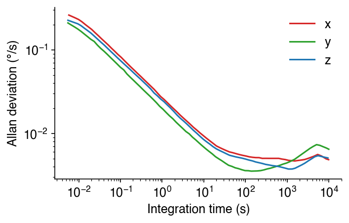
And here we’ve made the font size larger again. We’ll then export this as an SVG, make our annotations, and export again.

This is an improvement over